Northern Wisps
CABINS entry by Bartosz Domiczek
YulioVR LINK
Software
3dsmax, ZBrush, Corona Renderer, FloorGenerator, Forest Pack, RailClone, MultiScatter, GrowFX, Substance Painter, Photoshop, ArionFX
This is my final entry for the CABINS challenge. I had a lot of fun with this project and I have been working on it consequently since the beginning of the challenge. In the end, I have made 18 still image renderings and three spherical renderings. Some more complex, other ones focusing on the details or being some kind of trivial stuff.
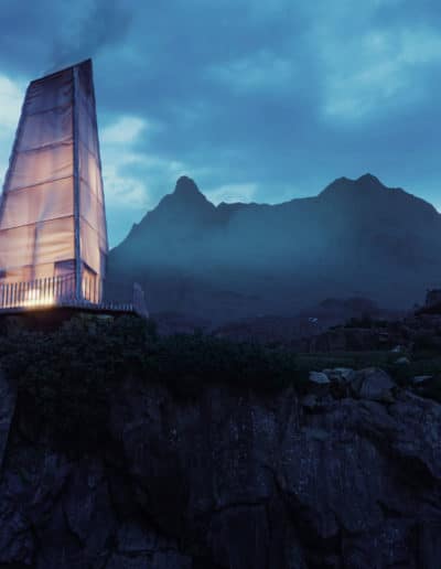
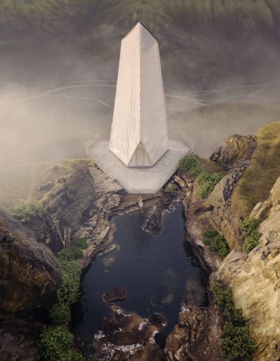
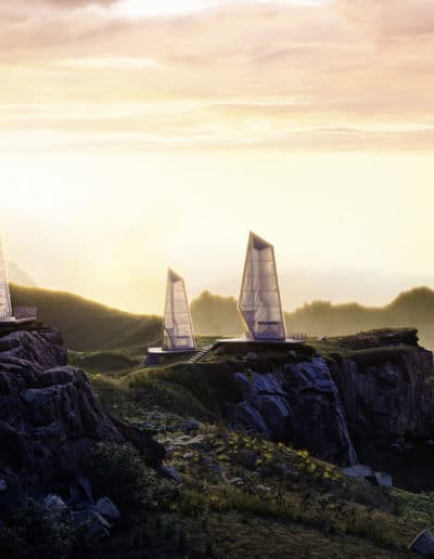
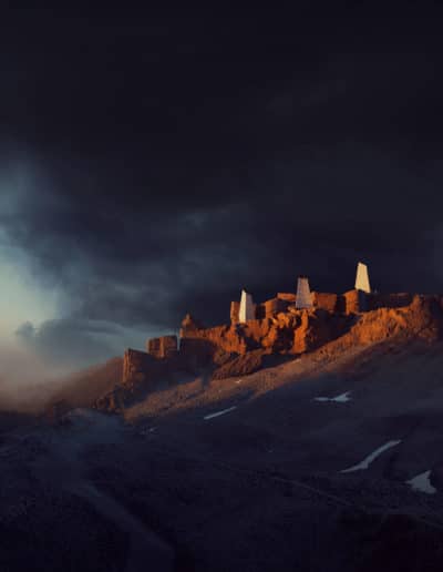
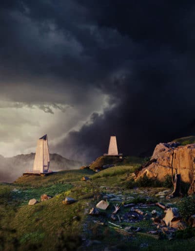
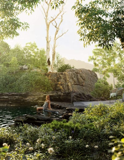
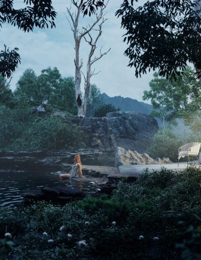
My cabins are placed in Icelandic Thórsmörk but I made several different scenes to show various aspects of the place. From quite barren hills to lush woody areas.
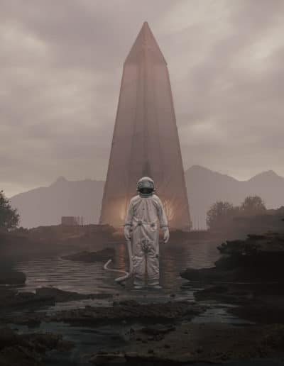
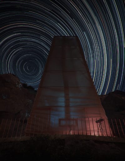
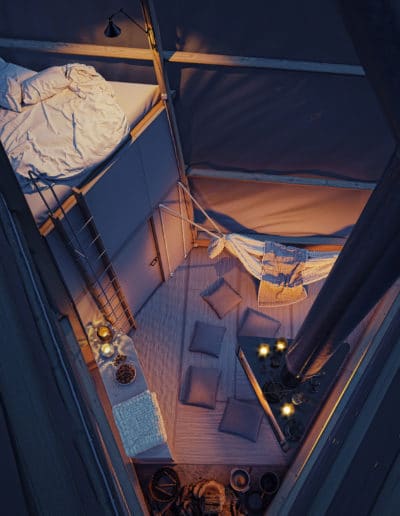
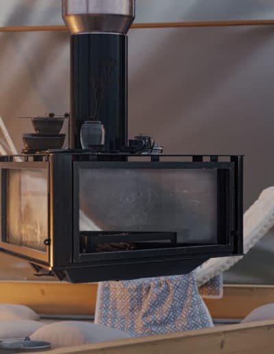
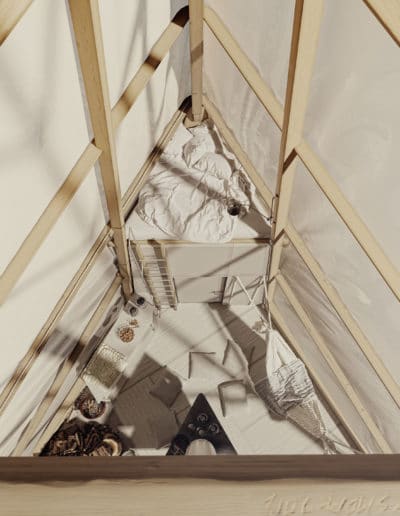
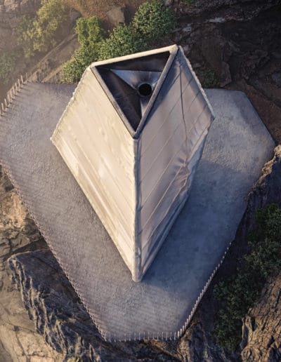
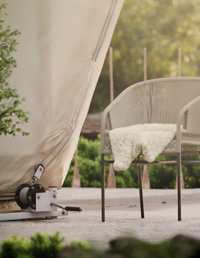
The cabins themselves are formed as white ephemeral monoliths, contrasting with the organic surrounding and being something between the reminiscence of the ancient dwelling built around the fireplace and the idea of Nordic gods standing in the row on a mountain ridge.
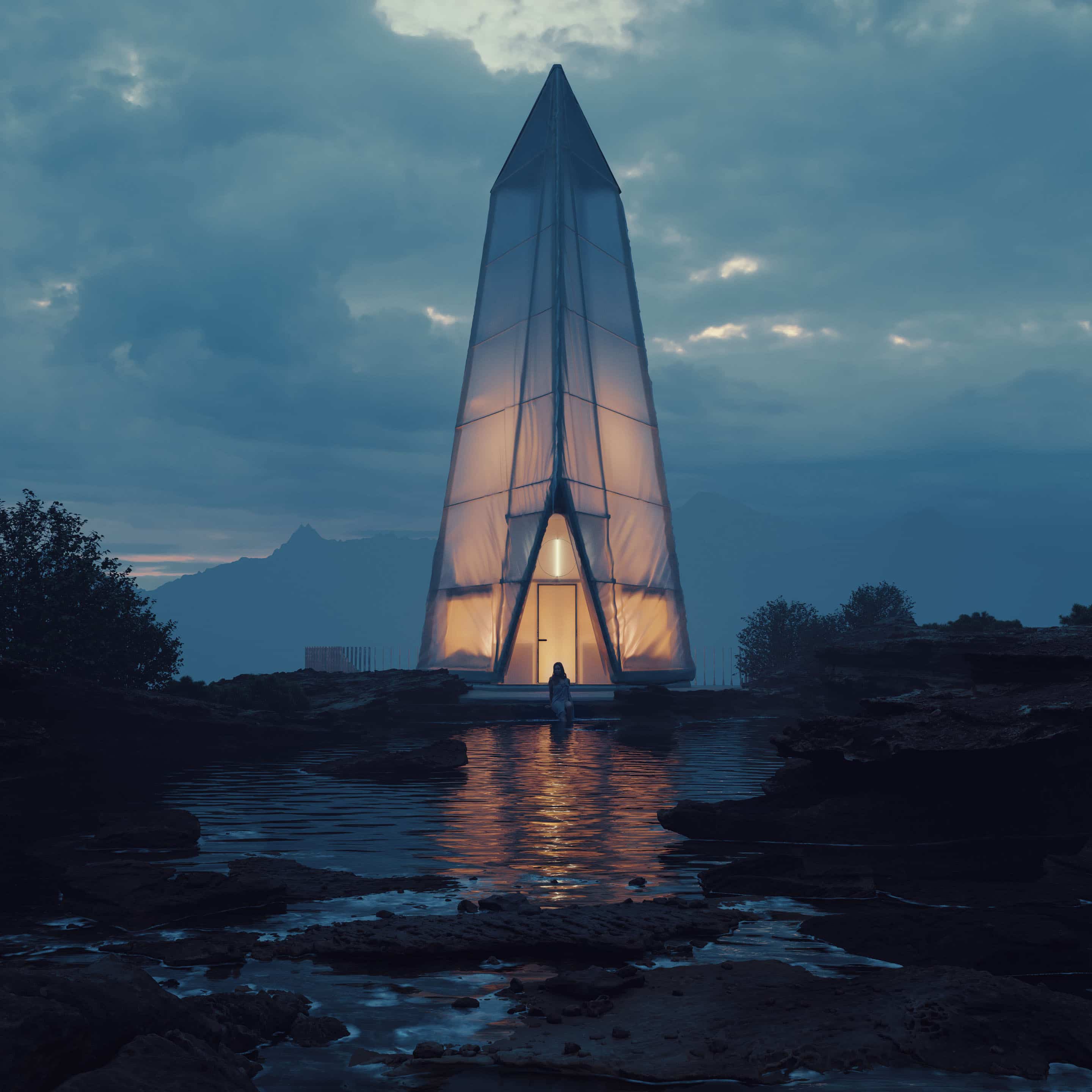
Northern Wisps HERO Image
Render by Bartosz Domiczek
“My cabins are placed in Icelandic Thórsmörk but I made several different scenes to show various aspects of the place. From quite barren hills to lush woody areas.”
Talk to us! What do you think of this entry?
Notable Replies
Continue the discussion at talk.ronenbekerman.com
11 more replies


Sure @youkishi
It was a must for the entry, but now that you mention it, I think listing the assets would be a good idea!
Hi. It might be difficult to list each one of them (they don’t have unique naming that’s easy to follow) but generally, I focused on rocks and there are examples of each type they provide (volcanic, granite, sandstone). Additionally, there are a few plants (most notably dead trees).
I love the composition intended for this image. A subject in the center is a beautiful way of enhancing its relevance. It would have been amazing to see a tiny bit more sky above the subject (cabin) in this image - I think it would bring more balance to the composition.
Beautiful work!
Thank you, Ronen, for inviting me here.
@jellyjuicelondon Thank you. I think you are right about the sky. I already thought about it but haven’t fixed it yet.
@youkishi I used highest LOD + displacement because I just could afford it with a bunch of memory available. : ) It’s usage went up to 170GB in some scenes (not this particular one). On the other hand, I am working now a bit on the video from this project and it looks pretty similar with this displacement turned off.
Hi @bartosz.domiczek
Please try to add that bit more sky to your image - I have edited your image in photoshop very quicly to explain what I mean and also to see if it would add much to your final result and I think you’d be surprised with the impact a simple change in aspect ratio would do. I’m surprised and I think you have done a wonderful job!
_
Well… to illustrate my study, this is your image with a little bit of sky added to the top:
And this is the grid I started it with:
_
Then I went even further and added an extra element to bring a bit more drama to the composition - I have placed a crescent moon in the central top third of your image. The moon has such a grand presence in nature that it can counterbalance an image composition really well even when very small. That additional sky plus a tiny moon would provide the perfect balance against the darker base of your image, in my opinion:
And again… This is the grid for the second composition:
_
That is just a study case I’ve done quicky based on your work. I hope you like it and I’m sorry for the lousy photoshop work (I’m quite busy today)!